Pretty 🌸 Terminals
The https://github.com/apparebit/prettypretty repository hosts two Rust crates:
- The prettytty crate provides terminal I/O and configuration. The API documentation on GitHub pages reflects current development, whereas docs.rs reflects the latest release.
- The prettypretty crate provides adjustable styles for terminal applications, with a focus on colors. As for prettytty, the API documentation on GitHub pages reflects current development, whereas docs.rs reflects the latest release.
Only the latter crate has Python bindings. However, the prettypretty package has its own terminal abstraction and several useful scripts for visualizing colors and color themes.
Pretty 🌸 Pretty
Prettypretty is a Rust library with optional Python integration that brings 2020s color science to 1970s terminals for building awesome terminal user interfaces (TUIs). The intended benefits are twofold:
- You get to design and build the TUI with all the expressivity and convenience of high-resolution color and color spaces, including the perceptually uniform Oklab whether in Cartesian or polar form, with original or revised lightness.
- Prettypretty takes care of reconciling the intended appearance with the capabilities of the terminal, the current runtime context including light or dark mode, and the user’s preferences, whether they lean FORCE_COLOR or NO_COLOR.
To make that possible, prettypretty provides simple abstractions for terminal and high-resolution colors alike, facilitates seamless conversion between them and common color spaces, and implements state-of-the-art algorithms for, say, gamut-mapping, color interpolation, perceptual contrast, as well as its own hue- and lightness-based downsampling for optimal selection of ANSI colors.
Impact
🎖️ Prettypretty was featured on the Real Python podcast episode #211.
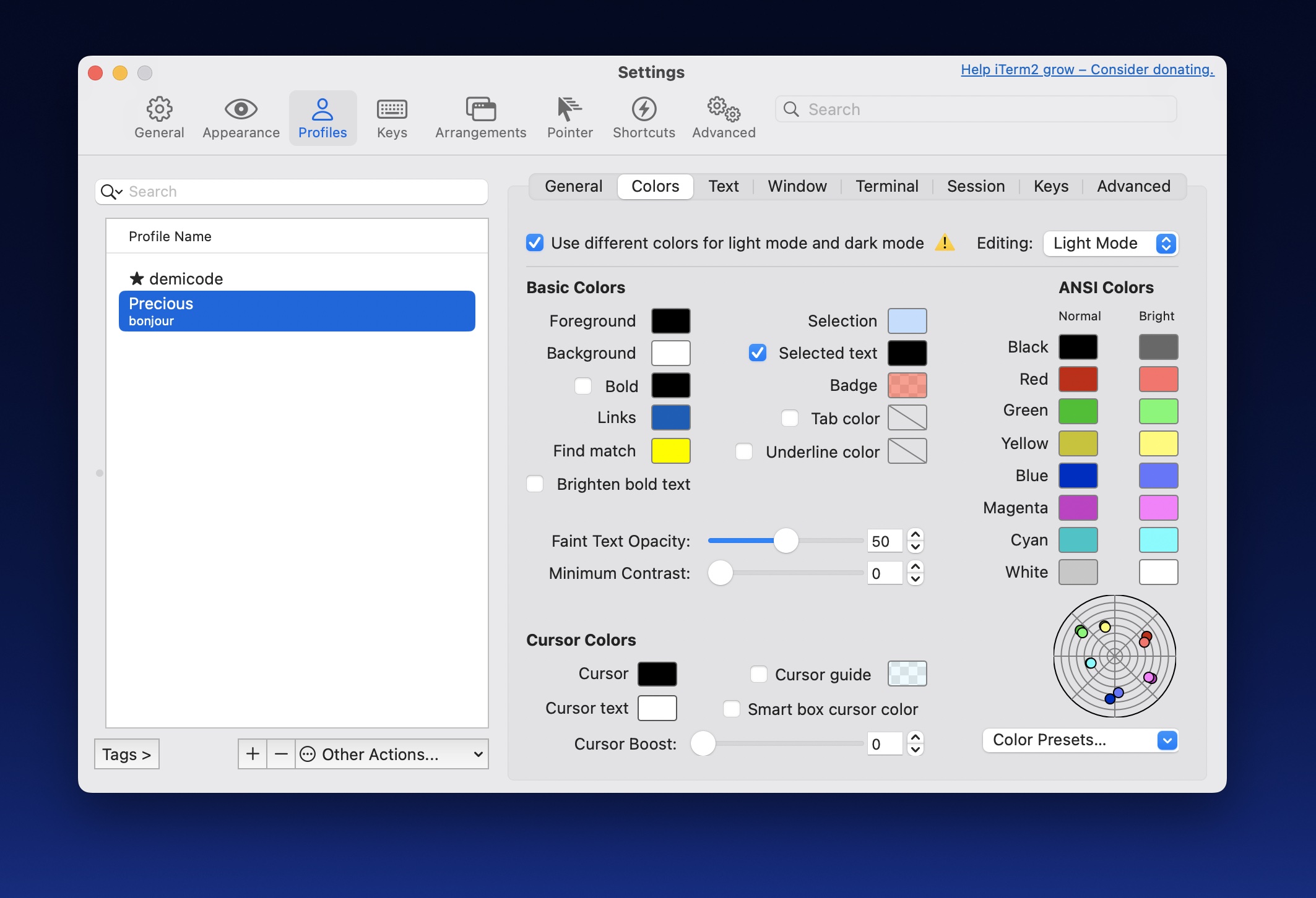
🎖️ Prettypretty inspired iTerm2’s color preferences:
Resources
To find out more, please keep reading this user guide and also leverage the following resources:
- This User Guide
- Rust API documentation on GitHub, with Python integration
- Rust API documentation on docs.rs, without Python integration
- Python API documentation
- Python type stub
- Rust crate
- Python package
- GitHub Repository
- Changelog
Python Integration
The optional Python integration, enabled with the pyffi feature flag, relies
on PyO3 and Maturin for
building an extension module with the same functionality—only where the Rust
library uses trait implementations, the Python module uses dedicated
methods.
Also, where the Rust library currently is BYO(T)IO, that is, bring your own
(terminal) I/O, the Python library comes with a powerful terminal abstraction
that makes, say, querying the terminal for the current color
theme
a breeze.
Command Line Scripts
Prettypretty includes several Python scripts that illustrate use of the library.
You may find that plot and grid are useful on their own, as they help
visualize high-resolution colors (plot) as well as terminal colors (grid).
-
prettypretty.progress illustrates the library’s use on the example of a progress bar in less than 100 lines of Python. The finished progress bar is shown below for both light and dark themes.
-
prettypretty.plot charts colors on the chroma/hue plane of Oklab, if you don’t feed it colors defaulting to your terminal’s current color scheme. Here’s the one for the basic theme in Apple’s Terminal.app:

-
prettypretty.grid visualizes perceptual contrast and color downsampling strategies, exhaustively for the 6x6x6 RGB cube embedded in 8-bit color and selectively for 32x32 slices through the much bigger 24-bit RGB cube.
-
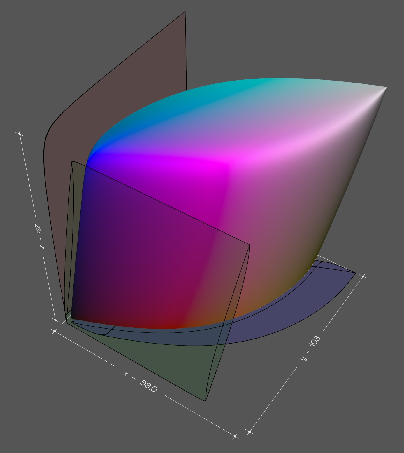
prettypretty.viz3d traces the boundaries of the visual gamut in 3D and saves the corresponding point cloud or mesh in PLY format. The screenshot below shows Vedo’s rendering.
Acknowledgements
I wrote much of prettypretty over a two-month period in 2024. Twice. I first implemented the core color routines in Python and then I did so again in Rust. At this point, only the Rust version survives. But Python remains a tier-1 runtime target for prettypretty. Two things really helped with getting this project started. First, I had been toying with different approaches to terminal styles for a while and knew what I was looking for. Second, I benefitted tremendously from Lea Verou’s and Chris Lilley’s work on the Color.js library and CSS Color 4 specification. Prettypretty directly reuses Color.js’ formulae for conversion between color spaces and implements several CSS Color 4 algorithms.
Copyright 2024-2025 Robert Grimm. The source code for prettypretty has been released as open source under the Apache 2.0 license.
Installing Prettypretty
One of the challenges of bilingual software is the barrier to entry posed by tooling. Projects such as prettypretty typically require working toolchains for both programming languages and for bridging the foreign-function interface on top.
Ideally: Just Use Packages
Having said that, there is one convenient option that usually works for both Rust and Python projects: Just install the prettypretty package.
You install the Rust package thusly:
$ cargo install prettypretty
If you are running Linux, macOS, or Windows, you install the binary wheel for Python thusly:
$ pip install prettypretty
Either way, prettypretty leverages both programming languages to their fullest and hence requires relatively recent versions:
- According to cargo-msrv, the minimum supported Rust version is 1.77.2.
- According to vermin, the minimum supported Python version is 3.11.0.
Fallback: Compile the Extension Module
If installing a binary wheel for Python doesn’t work for you, building the extension module from source requires:
- Rust: Use rustup. It is robust and makes staying up-to-date easy. By comparison, when I tried using APT on Linux, the most recent Rust version was 6 months behind the most recent release and couldn’t compile prettypretty.
- Python: Use CPython.
Python.org offers binary installers for
macOS and Windows. On Linux, beware of package manager shenanigans. For
example, APT’s
python3package is missing Python’svenvstandard library package and you need to installpython3-venv, too.
If no binary wheel is available and your system has both Rust and Python installed, then pip should transparently fall back onto building from source. In other words,
$ pip install prettypretty
should still work.
If it doesn’t, building prettypretty’s extension module requires a third tool:
- Build tool for extension module: Use Maturin.
Options for installing maturin include
pip,brew, andcargo. The corresponding incantation starts with the tool name followed byinstallfollowed bymaturin.
For example,
$ cargo install maturin
downloads the source code for maturin and builds the tool. If you still cannot
run maturin, check the PATH environment variable. $HOME/.cargo/bin must be
included.
Once maturin is installed, build the extension module thusly:
$ maturin dev --all-features
Compile-Time Feature Configuration
That last command enabled all of prettypretty’s compile-time features. There are three:
f64selects the eponymous type as floating point typeFloatandu64asBitsinstead off32asFloatandu32asBits. This feature is enabled by default.gamutcontrols prettypretty’s support for tracing the boundaries of color spaces (mod gamut,ColorSpace::gamut) and the human visual gamut (mod spectrum). This feature is disabled by default.pyfficontrols prettypretty’s Python integration through PyO3. Enabling the feature activates handwritten code in prettypretty as well as new types and trait implementations generated by PyO3’s macros. This feature is disabled by default.
As a matter of policy, prettypretty’s Rust builds default to being minimalist.
Hence, the gamut feature is disabled by default. However, its Python builds
default to being maximalist. Hence, prettypretty’s Python packages includes the
gamut feature.
Stretch Goal: Install the Works
Whether you want to type-check the Python sources, build the documentation, run the code blocks embedded in the user guide, or generate visualizations, you’ll need additional libraries and tools:
- Pyright and Node.js: Prettypretty uses Pyright for type-checking Python code, largely because mypy is just too buggy. Alas, Pyright is written in JavaScript and requires Node.js to run.
- mdBook: Building the user guide and running embedded code blocks
requires mdBook. Your
best best for installing it is
cargo install mdbook. - Sphinx: Building the Python API documentation requires this Python tool
and several extensions. Prettypretty’s
pyproject.tomllists all of them under theproject.optional-dependencies.devkey. - matplotlib and vedo: Running
prettypretty.plot
requires the matplotlib package and running
prettypretty.viz3d
with the
--renderoption requires the vedo package. Prettypretty’spyproject.tomllists them under theproject.optional-dependencies.vizkey.
Yikes! That’s getting a bit much. Thankfully, there is another option.
Salvation: Automating Everythin With r²
If you want the works, pulling everything together is a bit involved. That’s why I wrote r², prettypretty’s runner script. It installs all dependencies, builds the extension module, performs extensive checks, and generates the documentation. To get started, try:
$ ./rr.sh help
Prettypretty’s One-Two-Three
Prettypretty’s integration of 2020s color science with 1970s terminal output enables a fresh take on styling the output of command line applications. Similar to CSS on the web, that approach treats styles as dynamic, with rendered results looking differently on different terminals. However, while CSS favors progressive enhancement, i.e., starting with a more basic design and adding features and flourishes as screen sizes and computing power increase, prettypretty builds on graceful degradation, i.e., starting with expressive styles and automatically adjusting them to user preferences and less capable terminals. Very much like CSS, prettypretty delivers better results, when you author for variability. Prettypretty’s workflow is based on three major steps. This chapter provides an overview of prettypretty’s one-two-three. The deep dive on the progress bar script adds, ahem, depth.
1. Fluently Assembling Styles
The first step is the fluent assembly of Style objects. Each such style may
include a text Format (well, technically a [`FormatUpdate]), a foreground
color using any supported color format, and a background color using any
supported color format.
The following example fluently assembles a style for bold black text on yellow background:
#![allow(unused)]
fn main() {
extern crate prettypretty;
use prettypretty::{Color, ColorSpace};
use prettypretty::style::{Attribute, FormatUpdate, Style};
use prettypretty::termco::{Colorant, Rgb};
let style = Style::default()
    .bold()
    .with_foreground(Color::default())
    .with_background(Rgb::new(0xff, 0xe0, 0x6c));

assert_eq!(style.format(), FormatUpdate::from(Attribute::Bold));
assert_eq!(style.foreground(),
    Some(Colorant::HiRes(Color::new(
        ColorSpace::Xyz, [0.0, 0.0, 0.0]))).as_ref());
assert_eq!(style.background(),
    Some(Colorant::Rgb(Rgb::new(255, 224, 108))).as_ref());
}
Best practice is to define a complimentary style for dark mode as well. Since colors tend to appear more saturated in dark mode, simply switching foreground and background colors doesn’t work. Instead pick a less saturated yellow and also a less dark black. Once you picked those colors, how about assembling the corresponding style in Rust?
2. Adjusting the Fidelity of Styles
The second step is adjusting those pretty assembled styles to the capabilities
of the current terminal and to user preferences, e.g., NO_COLOR, as captured
by Fidelity levels. Fidelity::from_environment determines likely
terminal capabilities based on environment variables. Meanwhile, Translator
performs the actual conversion. You instantiate a translator with the colors for
the current color theme.
Once you have the right fidelity level and a translator, you pick between
styles for light or dark mode with the Translator::is_dark_theme. And you
adjust the selected styles with Style::cap.
The example code shows how to adjust the style from the previous example for a terminal that renders 8-bit colorts only.
#![allow(unused)]
fn main() {
extern crate prettypretty;
use prettypretty::{Color, OkVersion, Translator};
use prettypretty::style::{Fidelity, Style};
use prettypretty::termco::{AnsiColor, Colorant, Rgb};
use prettypretty::theme::VGA_COLORS;
let style = Style::default()
    .bold()
    .with_foreground(Color::default())
    .with_background(Rgb::new(0xff, 0xe0, 0x6c));
let translator = Translator::new(
    OkVersion::Revised, VGA_COLORS.clone());
let style = style.cap(Fidelity::Ansi, &translator);

assert_eq!(style.foreground(),
    Some(Colorant::Ansi(AnsiColor::Black)).as_ref());
assert_eq!(style.background(),
    Some(Colorant::Ansi(AnsiColor::BrightYellow)).as_ref());
}
3. Applying and Reverting Styles
The third step is actually using the assembled and adjusted styles. Applying a
style to text, say, prettypretty, is as simple as writing its display to the
terminal. Reverting the style again takes nothing more than writing the display
of the negation to the terminal.
The example illustrates how to apply the style from the example above to this
package’s name, prettypretty.
#![allow(unused)]
fn main() {
extern crate prettypretty;
use prettypretty::{Color, OkVersion, Translator};
use prettypretty::style::{Fidelity, Style};
use prettypretty::termco::{AnsiColor, Colorant, Rgb};
use prettypretty::theme::VGA_COLORS;
let style = Style::default()
    .bold()
    .with_foreground(Color::default())
    .with_background(Rgb::new(0xff, 0xe0, 0x6c));
let translator = Translator::new(
    OkVersion::Revised, VGA_COLORS.clone());
let style = style.cap(Fidelity::Ansi, &translator);
let s = format!("{}prettypretty{}", style, -&style);

assert_eq!(s, "\x1b[1;30;103mprettypretty\x1b[22;39;49m")
}
That’s all!
The 2020s: High-Resolution Color
High-resolution colors from the 2020s have three floating point coordinates and explicit color spaces:
ColorSpaceenumerates supported color spaces.Colorcombines a color space and three floating point coordinates into a precise color representation.
Much of prettypretty’s functionality is accessible through Color’s methods.
They include:
- Access to color space and coordinates
space,as_ref - Testing for achromatic colors
is_achromatic,is_achromatic_threshold - Conversion between color spaces
to - Gamut testing
in_gamut, clippingclip, and mappingto_gamut - Lightening
lightenand darkeningdarken - Perceptual contrast
contrast_against,use_black_text,use_black_background - Color difference
distance,find_closest_ok,find_closest - Interpolation
interpolate - Projection onto 2D plane
hue_chroma,uv_prime_chromaticity,xy_chromaticity
Using Color and Color Spaces
The example below illustrates how to use Color. First, it instantiates a
color in the Oklch color space, which is the cylindrical version of the
perceptually uniform Oklab color
space. The three coordinates are L,
C, and h—lightness, chroma, and hue. The latter is in degrees, which explains
why it is two orders of magnitude larger than the other coordinates. Oklab/Oklch
and their improved versions,
Oklrab/Oklrch,
feature prominently in prettypretty because their perceptual uniformity makes
them excellent predictors for actual colors. I call all four, tongue firmly in
cheek, the Oklab variations.
After creating the color in Oklch, the example code converts it to Display P3 and tests whether the color is in gamut—it is. “Gamut” is lingo for all the colors that belong to a color space. It is of critical importance for physical devices and processes because it determines the range of reproducible colors. If a color is out of gamut, it simply can’t be reproduced. Display P3 is the larger of two RGB color spaces commonly supported by contemporary displays.
The smaller color space is called sRGB. It has been the default color space for the web for the longest time. The code example converts the color to sRGB as well. It again tests whether the result is in gamut—it is not. As a final step, the example code “gamut maps” the color to sRGB. That again is lingo and refers to any sophisticated means, i.e., algorithm, for finding an in-gamut color that still resembles the original. Meanwhile “clipping” or “clamping” is the crude means for producing in-gamut colors: It simply forces the coordinates into range, resetting them to the minimum or maximum if not.
#![allow(unused)]
fn main() {
extern crate prettypretty;
use prettypretty::{Color, ColorSpace, assert_same_color};
let oklch = Color::oklch(0.716, 0.349, 335.0);
let p3 = oklch.to(ColorSpace::DisplayP3);
assert!(p3.in_gamut());

let not_srgb = oklch.to(ColorSpace::Srgb);
assert!(!not_srgb.in_gamut());

let srgb = not_srgb.to_gamut();
assert_same_color!(srgb, Color::srgb(1.0, 0.15942348587138203, 0.9222706101768445));
}
Different Color Spaces for Different Folks
Color::to_gamut
implements the CSS Color 4
algorithm for gamut mapping. One noteworthy aspect of the algorithm is its
simultaneous use of three differrent color spaces. It generates candidate colors
in Oklch by adjusting the chroma of the original color (and leaving lightness
and hue unchanged). It produces in-gamut colors by clipping the candidates in
the target color space, here sRGB. And it determines whether the clipped
candidates fall within the just noticeable difference (JND), i.e., are good
enough, by calculating their distance from the candidates in Oklab. In other
words, there is no ideal color space, and different color spaces excel at
different tasks.
I Haz Color Swatches
Since the numeric coordinates in the code examples aren’t very colorful but supposedly do represent colors—independent of whether they are beautiful, garish, subdued, saturated, or what have you—each code block has its own color swatch that shows the colors mentioned in the code. Here is the one for the code block above:
Since the second color is in-gamut for sRGB and sRGB is widely supported, your screen and my screen are probably showing the same color for the second square of the color swatch. If your screen, like mine, also supports Display P3, then the same should hold for the first square and it should show a brighter, purer magenta than the second one. However, if your screen only supports sRGB, then the first square should show the same color as the second square. That’s because CSS Color 4 requires gamut mapping out-of-gamut colors and prettypretty implements the CSS Color 4 algorithm. But for some reason, the developers for all major browsers are having second thoughts about gamut mapping and instead just clip colors.
Revisiting the Example Code in Python
With Python being a first-tier runtime target for prettypretty, this guide tries to feature all example code for both languages. Here then is the Python version of the above code. It doesn’t look all that different.
from prettypretty.color import Color, ColorSpace
oklch = Color.oklch(0.716, 0.349, 335.0)
p3 = oklch.to(ColorSpace.DisplayP3)
assert p3.in_gamut()

not_srgb = oklch.to(ColorSpace.Srgb)
assert not not_srgb.in_gamut()

srgb = not_srgb.to_gamut()
assert srgb == Color.srgb(1.0, 0.15942348587138203, 0.9222706101768445)
The 1970s: Terminal Colors
In contrast to high-resolution colors, which fit into a nicely uniform representation with a color space tag and three coordinates, terminal color formats from the 1970s and 1980s may not even have coordinates, only integer index values. ANSI escape codes support four different kinds of colors:
- The default foreground and background colors.
AnsiColor, the 16 extended ANSI colors.- 8-bit indexed colors, which comprise
AnsiColor,EmbeddedRgb, andGrayGradient. Rgb, 24-bit RGB colors.
Treating these color types uniformly requires one more:
Colorantnot only has variants forAnsiColor,EmbeddedRgb,GrayGradient, andRgb, but also for the default colorColorant::Defaultand high-resolutionColor.
Colorant::Default represents either the default foreground or background
color, depending on context. Default colors, like ANSI colors, have no intrinsic
color values and hence are abstract. Unlike all other colors, which display
just the same in the foreground and background, they also are
context-sensitive. However, since prettypretty already needs to distinguish
between foreground and background colors for all other colors, having only one
context-free default color makes for less awkward use, a claim based on
experience.
AnsiColor represents the 16 extended ANSI colors. They are eight base
colors—black, red, green, yellow, blue, magenta, cyan, and white—and their
bright variations—including bright black and bright white. ANSI colors have
names but no agreed-upon, intrinsic color values.
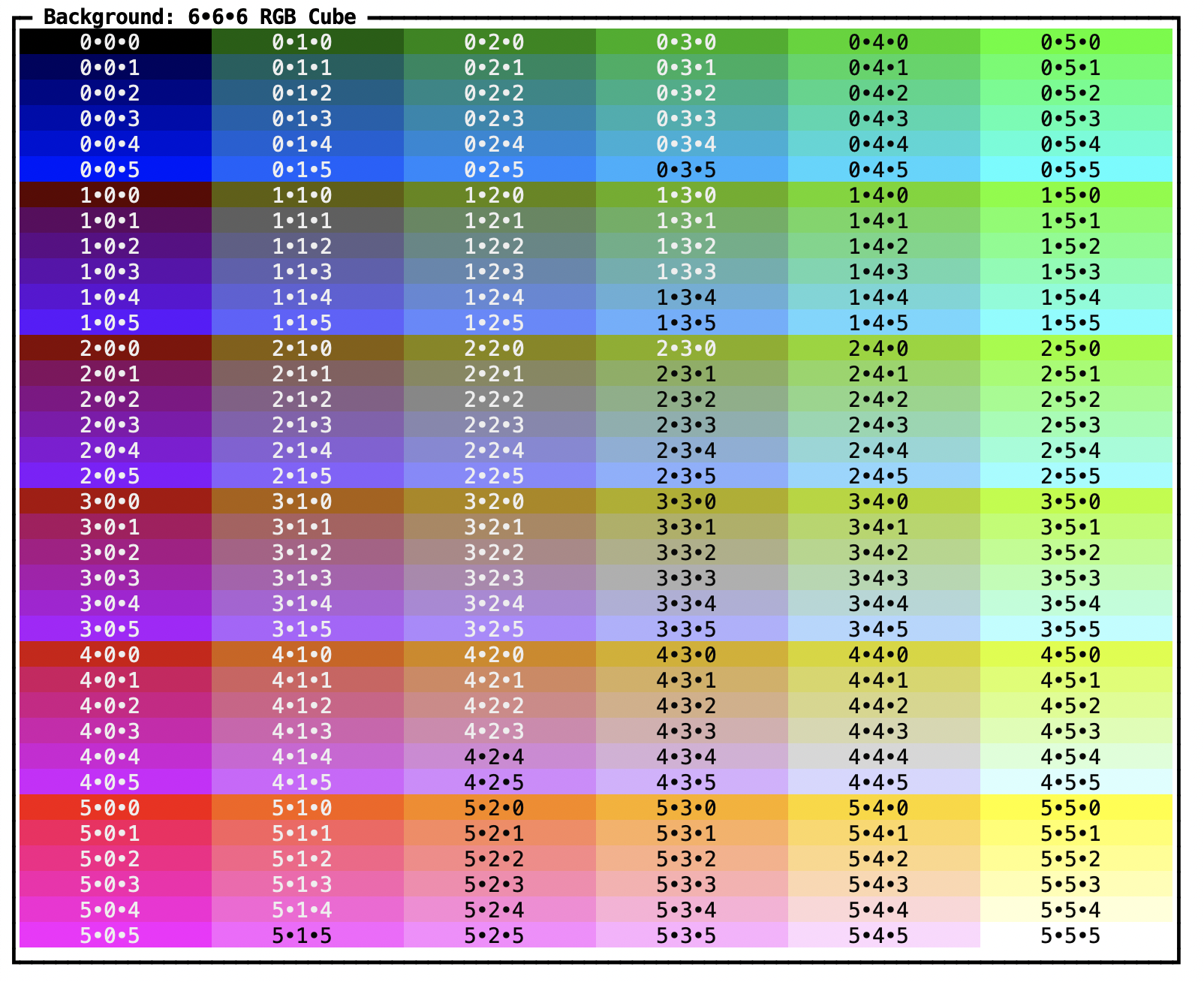
EmbeddedRgb is a 6x6x6 RGB cube, i.e., every coordinate ranges from 0 to
5, inclusive. Xterm’s formula for converting to 24-bit RGB colors is widely
accepted. The color swatch below shows all 216 colors, with blue cycling
every column, green increasing every six columns, and red increasing every
row. It’s only the first of many color swatches throughout the
documentation.
GrayGradient represents a 24-step gradient from almost black to almost
white. As for the embedded RGB cube, Xterm’s formula for converting to
24-bit RGB grays is widely accepted. The color swatch below illustrates the
gray gradient.
EightBitColor combines the previous three colors into a single type for all
8-bit colors. Using the From trait, instances of AnsiColor,
EmbeddedRgb, GrayGradient, and u8 convert to EightBitColor, which
in turn converts to u8 and Colorant (see below). This enumeration exists
to conveniently and precisely represent 8-bit colors.
Rgb represents 24-bit RGB colors. Even in the early 1990s, when
24-bit graphic cards first became widely available, the term was a misnomer.
For example, Kodak’s Photo CD was
introduced at the same time and had a considerably wider gamut than the
device RGB of graphic cards. Alas, the term lives on. Terminal emulators
often advertise support for 16 million colors by setting the COLORTERM
environment variable to truecolor.
Finally, Colorant combines the just listed types with high-resolution colors
into a single coherent type for all kinds of colors. It does not model that
ANSI colors can appear as themselves and as 8-bit indexed colors. Prettypretty
used to include the corresponding wrapper type, but the wrapper didn’t enable
new functionality and mostly just got in the way. All color types implement
Into<Colorant> and methods that require a colorant usually accept an impl
thereof, thus drastically reducing the need to manually wrap colors. A custom
conversion function for PyO3 effectively offers the same functionality in
Python, which also has Colorant.of().
Coding With Terminal Colors
The example code below illustrates how AnsiColor, EmbeddedRgb, and
GrayGradient abstract over the underlying 8-bit index space while also
providing convenient access to RGB coordinates and gray levels. Embedded RGB and
gray gradient colors also nicely convert to true as well as high-resolution
colors, but ANSI colors do not.
#![allow(unused)]
fn main() {
extern crate prettypretty;
use prettypretty::{Color, assert_same_color};
use prettypretty::error::OutOfBoundsError;
use prettypretty::termco::{AnsiColor, Colorant, EmbeddedRgb, GrayGradient, Rgb};
let red = AnsiColor::BrightRed;
assert_eq!(u8::from(red), 9);
// What's the color value of ANSI red? We don't know!

let purple = EmbeddedRgb::new(3, 1, 4)?;
let index = 16 + 3 * 36 + 1 * 6 + 4 * 1;
assert_eq!(index, 134);
assert_eq!(u8::from(purple), index);
assert_eq!(Rgb::from(purple), Rgb::new(175, 95, 215));
assert_same_color!(Color::from(purple), Color::from_24bit(175, 95, 215));

let gray = GrayGradient::new(18)?;
let index = 232 + 18;
assert_eq!(index, 250);
assert_eq!(gray.level(), 18);
assert_eq!(u8::from(gray), index);
assert_eq!(Rgb::from(gray), Rgb::new(188, 188, 188));
assert_same_color!(Color::from(gray), Color::from_24bit(188, 188, 188));

let green = Colorant::from(71);
assert!(matches!(green, Colorant::Embedded(_)));
if let Colorant::Embedded(also_green) = green {
    assert_eq!(also_green[0], 1);
    assert_eq!(also_green[1], 3);
    assert_eq!(also_green[2], 1);
    assert_eq!(Rgb::from(also_green), Rgb::new(95, 175, 95));
    assert_same_color!(Color::from(also_green), Color::from_24bit(95, 175, 95));
} else {
    unreachable!("green is an embedded RGB color")
}
Ok::<(), OutOfBoundsError>(())
}
The Python version is next. Even though Python does not support traits including conversion traits, most of the code is quite similar to the Rust version. It does help that the Python version adds a few methods that offer functionality equivalent to conversion traits.
from prettypretty.color import Color
from prettypretty.color.termco import AnsiColor, Colorant, EmbeddedRgb, GrayGradient, Rgb
red = AnsiColor.BrightRed
assert red.to_8bit() == 9
# What's the color value of ANSI red? We don't know!

purple = EmbeddedRgb(3, 1, 4)
index = 16 + 3 * 36 + 1 * 6 + 4 * 1
assert index == 134
assert purple.to_8bit() == index
true_purple = Rgb(*purple.to_24bit())
assert true_purple == Rgb(175, 95, 215)
assert purple.to_color() == Color.from_24bit(175, 95, 215)

gray = GrayGradient(18)
index = 232 + 18
assert index == 250
assert gray.level() == 18
assert gray.to_8bit() == index
true_gray = Rgb(*gray.to_24bit())
assert true_gray == Rgb(188, 188, 188)
assert gray.to_color() == Color.from_24bit(188, 188, 188)

green = Colorant.of(71)
assert isinstance(green, Colorant.Embedded)
also_green = green[0] # The only valid index is 0!
assert also_green[0] == 1
assert also_green[1] == 3
assert also_green[2] == 1
true_green = Rgb(*green.try_to_24bit())
assert true_green == Rgb(95, 175, 95)
assert also_green.to_color() == Color.from_24bit(95, 175, 95)
Accommodating All Colors
To reap the benefits of 2020s color science for 1970s terminal colors, we need to be able to translate between terminal and high-resolution colors at will, in both directions. THere are three reasons why doing just that is difficult:
- Whereas all high-resolution colors fit into a uniform model of coordinates tagged by their color spaces, different kinds of terminal colors have different representations from each other and from high-resolution colors. In other words, there is little uniformity amongst terminal colors.
- Some of the differences between terminal colors are not just differences of representation but rather radically different conceptualizations of color. In particular, ANSI colors have no intrinsic color values. On top of that, the default colors are also context-sensitive and hence of limited use.
- There are huge differences in the number of available colors: 16 ANSI colors versus 256 indexed colors versus 16 million true colors. Curiously, the bigger difference when it comes to translating colors is not the one from 16 million down to 256 colors but the one from 256 down to 16 colors.
Despite these substantial differences, many terminal color representations can
at least be partially and losslessly converted into a few other color
representations. For example, with exception of the ANSI colors, 8-bit colors,
as represented by EmbeddedRgb and GrayGradient, have well-defined
formulas for converting to index values, i.e., u8, as well as to 24-bit RGB
colors, i.e., Rgb. The latter, also called “true” colors, are easily
convertible to high-resolution Color. Meanwhile, AnsiColor, Color,
EmbeddedRgb, GrayGradient, and Rgb are all trivially
convertible to Colorant. But that’s also Colorant’s very purpose as
unifying wrapper type. Prettypretty accommodates these conversions with
From<T> and TryFrom<T> traits in Rust and static methods in Python. Alas,
those can’t help translate default and ANSI colors.
Translation Is Necessarily Stateful
Since the default and ANSI colors are abstract, translation to high-resolution colors necessarily requires some form of lookup table, i.e., a color theme. Prettypretty relies on the same abstraction to store that table as well as the derived state for translating high-resolution colors to terminal colors again:
Translatorprovides the logic and state for translating between terminal and high-resolution colors.
There is ample precedent for the use of color themes to provide concrete values for abstract colors. In fact, most terminal emulators feature robust support for the plethora of such themes readily available on the web. However, asking users to configure theme colors after they already configured their terminals decidedly is the wrong approach. Luckily, ANSI escape codes include sequences for querying a terminal for its current theme colors, making it possible to automatically and transparently adjust to the runtime environment.
The Fall From High-Resolution
Theme colors turn the translation of terminal to high-resolution colors into a simple lookup. The level of difficulty when translating in the other direction, from high-resolution to terminal colors, very much depends on the target colors:
24-Bit Colors
In the best case, when the source color is in-gamut for sRGB and the target are
24-bit “true” colors, a loss of numeric resolution is the only concern. It
probably is imperceptible as well. However, if the source color is out of sRGB
gamut, even when still targeting 24-bit colors and, like Translator, using
gamut-mapping, the difference between source and target colors may become
clearly noticeable. It only becomes more obvious when targeting 8-bit or ANSI
colors.
8-Bit Colors
While accuracy necessarily suffers when targeting less than 24-bit colors, translation to 8-bit colors actually isn’t particularly difficult. The reasons are twofold: First, there few enough colors that brute force search for the closest matching color becomes practical. Second, there are many enough colors that brute force search is bound to find a reasonable match. Critically, the embedded 6x6x6 RGB cube provides variations that go well beyond the primary and secondary colors.
Since the brute force search compares colors for their distance, two convenient color spaces for conducting that comparison are Oklab and Oklrab. The trick for achieving consistently good results, especially when translating more than one color, is to omit the ANSI colors from the set of candidate colors. Color themes are not designed for regular placement within any color spaces. So ANSI colors are bound to stick out amongst the more homogeneous embedded RGB and gray gradient colors. Besides, they only make up 1/16 of all 8-bit colors and hence don’t add much compared to other 8-bit colors.
ANSI Colors
Omitting ANSI colors is, of course, not feasible when targeting ANSI colors.
Still, brute force search over the ANSI colors works well enough most of the
time. But because there are so few candidates, the closest matching color may
just violate basic human expectations about what is a match, e.g., that warm
tones remain warm, cold tones remain cold, light tones remain light, dark tones
remain dark, and last but not least color remains color.
Translator::to_closest_ansi’s
documentation provides an example that violates the latter expectation, with a
light orange tone turning into a light gray. That is jarring, especially in
context of other colors that are not mapped to gray.
Hence, I developed a more robust algorithm for downsampling to ANSI colors. It
leverages not only uses color pragmatics, i.e., the coordinates of theme colors,
but also color semantics, i.e., their intended appearance. In other words, the
algorithm leverages the very fact that ANSI colors are abstract colors to
improve the quality of matches. As implemented by
Translator::to_ansi_hue_lightness,
the algorithm first uses hue in Oklrch to find a pair of regular and bright
colors and second uses lightness to pick the closer one. In my evaluation so
far, it is indeed more robust than brute force search. But it also won’t work if
the theme colors themselves are inconsistent with theme semantics. Since that
can be automatically checked,
Translator::to_ansi
transparently picks the best possible method.
Translator Methods
Now that we understand the challenges and the algorithms for overcoming them, we
turn to Translator’s interface. We group its method by task:
-
Translator::resolveandTranslator::resolve_alltranslate any color to a high-resolution color. Thanks to theInto<Colorant>trait and a custom PyO3 conversion function, both Rust and Python can invoke either method with an instance ofu8/int,AnsiColor,Color,Colorant,EmbeddedRgb,GrayGradient, orRgb. The difference between the two methods is thatresolvepanics when invoked on aColorant::Default, whereasresolve_alldoes not but also requires a secondLayerargument. -
Translator::to_closest_8bitandTranslator::to_ansitranslate high-resolution colors to low-resolution terminal colors. Prettypretty does not support conversion to the default colors and high-resolution colors can be directly converted to true colors, without requiring mediation throughTranslator.The
Translator::supports_hue_lightness,Translator::to_ansi_hue_lightness,Translator::to_closest_ansi, andTranslator::to_ansi_rgbmethods provide direct access to individual algorithms for converting to ANSI colors. For instance, I use these methods for comparing the effectiveness of different approaches. But your code is probably better off usingTranslator::to_ansi, which automatically picksto_ansi_hue_lightnessorto_closest_ansi. In any case, I strongly recommend avoidingto_ansi_rgb. It only exists to evaluate the approach taken by the popular JavaScript library Chalk and reliably produces subpar results. Ironically, Chalk’s tagline is “Terminal string styling done right.” -
Translator::captanslates reduces the resolution of colors. Likeresolveandresolve_all, this method can be invoked on arbitrary colors. Under the hood, it may very well translate terminal colors to high-resolution colors only to translate them to terminal colors again. Use this method to adjust terminal colors to the runtime environment and user preferences, which can be concisely expressed by aFidelitylevel. -
Translator::is_dark_themedetermines whether the color theme used by this translator instance is a dark theme.
Translator eagerly creates the necessary tables with colors for brute force and
hue-lightness search in the constructor. Altogether, an instance of this struct
owns 306 colors, which take up 7,160 bytes on macOS. As long as the terminal
color theme doesn’t change, a translator need not be regenerated. That also means
that it can be used concurrently without locking—as long as threads have their
own references.
Translator
The example code below illustrates the use of each major entry point besides
to_closest_8bit, which isn’t that different from to_ansi:
#![allow(unused)]
fn main() {
extern crate prettypretty;
use prettypretty::{Color, OkVersion, Translator};
use prettypretty::style::Fidelity;
use prettypretty::termco::{AnsiColor, EmbeddedRgb, Rgb};
use prettypretty::theme::VGA_COLORS;
use prettypretty::error::ColorFormatError;
use std::str::FromStr;
let red = &VGA_COLORS[AnsiColor::BrightRed];
assert_eq!(red, &Color::srgb(1.0, 0.333333333333333, 0.333333333333333));

let translator = Translator::new(OkVersion::Revised, VGA_COLORS.clone());
let also_red = &translator.resolve(AnsiColor::BrightRed);
assert_eq!(red, also_red);

let black = translator.to_ansi(&Color::srgb(0.15, 0.15, 0.15));
assert_eq!(black, AnsiColor::Black);

let maroon = translator.cap(Rgb::new(148, 23, 81), Fidelity::EightBit);
assert_eq!(maroon, Some(EmbeddedRgb::new(2,0,1).unwrap().into()));
Ok::<(), ColorFormatError>(())
}
The Python version is a close match:
from prettypretty.color import Color, OkVersion, Translator
from prettypretty.color.style import Fidelity
from prettypretty.color.termco import AnsiColor, Colorant, EmbeddedRgb, Rgb
from prettypretty.color.theme import ThemeEntry, VGA_COLORS
red = VGA_COLORS[ThemeEntry.Ansi(AnsiColor.BrightRed)]
assert red == Color.srgb(1.0, 0.333333333333333, 0.333333333333333)

translator = Translator(OkVersion.Revised, VGA_COLORS)
also_red = translator.resolve(AnsiColor.BrightRed)
assert red == also_red

black = translator.to_ansi(Color.srgb(0.15, 0.15, 0.15))
assert black == AnsiColor.Black

maroon = translator.cap(Rgb(148, 23, 81), Fidelity.EightBit)
assert maroon == Colorant.Embedded(EmbeddedRgb(2, 0, 1))
The Appearance of Progress
To explore how command line tools can benefit from prettypretty’s approach to terminal styling, this deep dive explores how to display a progress bar. I picked this topic for a few reasons:
- I’ve been itching to write a progress bar for quite a while now.
- An animated demo often is more interesting than a static one.
- The progress bar is simple enough to fit into less than 120 lines of Python.
- The progress bar is actually used by prettypretty’s plot.py
The complete script is, of course, part of prettypretty’s
distribution.
It started out as a demo script that was less than 100 lines long. But then
plot.py needed a progress bar. So I abstracted over the progress bar
implementation through the ProgressBar class, which added almost 20 lines.
Visualizing Progress
To get started, you probably want to run the progress bar script yourself. So please create a new virtual environment, install prettypretty into it, and run the progress bar script:
$ mkdir progress
$ cd progress
$ python -m venv .venv
$ source .venv/bin/activate
$ python -m pip install prettypretty
Downloading prettypretty-0.11.0-cp311-abi3-macosx_10_12_x86_64.whl (420 kB)
Installing collected packages: prettypretty
Successfully installed prettypretty-0.11.0
$ python -m prettypretty.progress
Please note that prettypretty requires Python 3.11 or later. Pre-built binary
wheels are available for Linux, macOS, and Windows. Building prettypretty from
source requires a number of tools in addition to the Rust compiler and Python
interpreter. The runner
script in the
repository root has an install option to automatically install them on a
system.
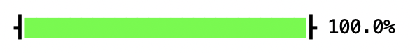
The last command amongst the shell incantations above actually executes the progress bar script. You should see a green bar rapidly go from 0% to 100%. If your terminal uses a light theme, it probably ends up looking like this:
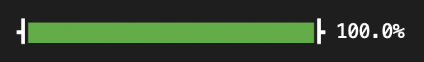
If your terminal uses a dark theme, it probably ends up looking more like this:
Notice that the two progress bars use different tones of green. In particular, the green tone for the dark theme is considerably less bright and vivid. That is by design. Human vision adapts to lighting conditions and we tend to perceive the same colors more intensely when they are presented in a darker context.
Design Thinking for Terminal Tools
In addition to colors, terminals support a few more attributes for styling text, including bold, italic, and underlined. Of course, we could just write the corresponding ANSI escape sequences to the terminal. Mind you, we’d still rely on a nicely encapsulated terminal logger with clearly distinguishable styles for status updates versus error messages. But considerable experience with styling the web serves as stark reminder that presentational aspects better be separated from content. In fact, maintaining that separation in a principled manner typically results in more consistent user interfaces that may just offer a better user experience. It also helps with engineering, e.g., by discouraging code duplication.
Achieving something similar for terminal applications is entirely within our reach. That doesn’t mean we should slavishly follow design methodologies for the web and repurpose its technologies. Far from it. For instance, where the web encourages progressive enhancement from basic sRGB colors to colors in more expressive as well as wide-gamut color spaces, prettypretty goes the opposite direction and offers automatic graceful degradation. Here then is prettypretty’s one-two-three for better terminal styles.
1. Assemble Styles
If we are to isolate terminal styles from content, we should start by grouping
the definitions for all application styles together. For the progress bar,
that’s a grand total of two styles. You’ll find their definitions inside the
ProgressBar class:
LIGHT_MODE_BAR = Style().with_foreground(Color.p3(0.0, 1.0, 0.0))
DARK_MODE_BAR = Style().with_foreground(Rgb(3, 151, 49))
It’s a little verbose, what with the withs and nested color expressions. But
experiments with alternative constructs weren’t that much shorter and definitely lost clarity.
When declaring styles, only include attributes that you want set and nothing
else. Don’t bother with defining styles that undo other styles. You can easily
and automatically compute them by negating styles, i.e., by applying Rust’s or
Python’s unary minus operators. In other words, -style undoes all attributes
set by style and hence restores the terminal to its default appearance. In the
future, prettypretty may also add support for binary minus to compute the
difference between two styles.
2. Adjust Styles
The light mode style uses the green primary of the Display P3 color space for background color. As illustrated by the figure below for a 2D projection onto the hue/chroma plane of Oklab, the Display P3 color space is strictly larger than sRGB and the green primary, by definition, is one of the three most distinct colors. That, of course makes the style entirely aspirational because (AFAIK) there are no terminals or terminal emulators that support colors other than sRGB. In short, command line applications need to adjust styles before using them.

The above graph, by the way, was generated with prettypretty:
$ python -m prettypretty.plot -c "color(display-p3 0 1 0)" \
    --no-light --no-term --gamut srgb --gamut p3 --strong-gamut \
    -o green-primary-p3.svg
(This particular invocation of plot won’t display any progress bars because it
doesn’t perform any of the slow operations.)
2.1 Determine Terminal Capabilities and Configuration
To fully adjust styles, however, we need to know a little more about the script’s runtime environment:
- To pick light or dark styles, we need the current display mode.
- To pick amongst ANSI colors, we need the color values for the terminal’s current color theme.
- To produce realistic colors, we need the color formats supported by the terminal.
As it turns out, ANSI escape codes include sequences for querying a terminal’s current color values, notably for default as well as ANSI colors. Most terminals seem to support them as well. Once we know the default colors, we can easily deduce the color theme, simply by converting to XYZ color space and then comparing the Y or luminance values. If the luminance of the foreground color is smaller than that of the background color, the terminal is in light mode and vice versa.
As far as supported color formats are concerned, we don’t need a list of
formats, only a maximum level that covers the three scenarios found in the wild,
ANSI colors only, 8-bit colors (which incorporate ANSI colors), and 24-bit
colors. To complete our model for these fidelity levels, we start with a
bottom level, no support for ANSI escapes, then add a level for no color to
cover actual terminals as well as user preferences (e.g., the NO_COLOR
environment variable), then the three support levels found in the wild, and then
an aspirational top level that includes high-resolution colors:
- No ANSI escapes
- No colors
- ANSI colors only
- 8-bit colors
- 24-bit colors
- High-resolution colors
The distinction between the first two levels is, unfortunately, ignored by many terminal applications. Yet there are meaningful and important differences between the two levels. Without ANSI escapes, application output is append-only, which gets in the way of animations and other sophisticated UI effects. Without colors, cursor control, alternate screen, URLs, shell integration, and even blinking text 😱 are all available and, if properly used, can significantly enhance the user experience. In short, terminal applications should recognize the difference and support both.
While there are no widely supported ANSI escape sequences to query terminals for their fidelity level, environment variables typically provide enough information to heuristically determine the fidelity level with high confidence. Prettypretty includes such a heuristic for fidelity levels and also supports querying the terminal for its color theme. Alas, the latter functionality has not been unified, currently relying on two very different implementations.
Our script’s main function initializes said terminal thusly:
with (
   Terminal(fidelity=options.fidelity)
   .terminal_theme()
   .hidden_cursor()
   .scoped_style()
) as term:
The constructor accepts options.fidelity so that users can override the
automatically determined fidelity level. terminal_theme() queries the terminal
for its current theme and creates a Translator based on the theme; the
instance is accessible through current_translator. hidden_cursor() hides
the cursor during execution of the with statement and scoped_style() makes
sure that the default appearance is restored on errors.
That does feel a little boilerplaty. But terminal_theme() performs substantial
I/O, writing 18 ANSI escape sequences to query color values and reading as many
ANSI escape sequences with color values. That takes time and may fail. So an
explicit interface is the right choice. The other methods are Python candy and
there is plenty more of that, including for updating the
Terminal.window_title, using the Terminal.alternate_screen, performing
Terminal.batched_output, and enabling Terminal.bracketed_paste. While
nice to have, they don’t really fit into prettypretty’s color-driven mission and
may be removed in the future.
2.2 Select and Cap Styles
The primary benefit of setting up the Terminal is access to a Translator,
which is implemented in Rust. Using said translator, picking between styles
for dark or light mode as well as capping a style’s fidelity level becomes
straight-forward. The first two lines of ProgressBar.__init__ read:
style = DARK_MODE_BAR if current_translator().is_dark_theme() else LIGHT_MODE_BAR
self._style = style.cap(term.fidelity, current_translator())
Doing so once during initialization means that the resulting styles are ready
for (repeated) display, while incurring the overhead of color conversion only
once. For good measure, the instance is reusable as well. For example, plot
displays up to three progress bars, all backed by a single instance.
3. Apply Styles
We assembled and adjusted the progress bar styles. So all that’s left is applying them as well. This part is really easy.
The last line of the ProgressBar._format method uses the assembled and
adjusted style:
return [' ┫', self._style, bar, -self._style, '┣', f' {percent:5.1f}%']
It also uses the negated style to restore the terminal’s default appearance.
The main function uses ProgressBar as follows. It instantiates the instance,
loops over progress reports to render(percent), and calls done() when it is
done:
progress = ProgressBar(term)

for percent in progress_reports():
     progress.render(percent)
     time.sleep(random.uniform(1/60, 1/10))

progress.done()
Each iteration processes a progress report by formatting the progress bar and writing it to the terminal.
And that’s it.
What Does It Take?
Well. There still is more code to prettypretty.progress. But much of that code
is not specific to prettypretty. Here’s the breakdown of per-section line counts
for the script:
| Section | pretty¹ | prettyⁿ | LoC | blank |
|---|---|---|---|---|
| Imports | 6 | 10 | 1 | |
| Argument parser | 16 | |||
ProgressBar init | 4 | 18 | 4 | |
_format method | 1 | 12 | 3 | |
render(), done() | 11 | 1 | ||
| Progress “reports” | 7 | |||
main() | 6 | 3 | 16 | 2 |
Calling main() | 2 | |||
| Between sections | 10 | |||
| Total | 12 | 8 | 92 | 21 |
The final two columns count all lines of the script and distinguish between lines-of-code, or LoC, and blank lines, to a total of 92 lines-of-code in a 113 line script. The middle two columns count lines-of-code specific to prettypretty and distinguish between code that is a constant cost of using prettypretty, i.e., required only once per module or app, in the pretty¹ column and code that is a variable cost of using prettypretty, i.e., required for each distinct style, in the prettyⁿ column.
Overall, these line counts are encouraging: Code specific to prettypretty comprises 18 out of 92 or a fifth of the lines-of-code, even though the script does little else than display styled text. Most of the code specific to prettypretty, i.e., 12 out of 18 or two thirds of the lines-of-code, is a constant cost, i.e., necessary for importing types and initializing the terminal. Without prettypretty, using literal ANSI escape sequences, the script would still require two lines for first formatting and then writing the progress bar. So the line overhead of prettypretty’s one-two-three workflow is 8 instead of 2 lines-of-code or 4× per style. That seems low for an application that is easier to maintain because all styles are defined in one location, accommodates light and dark mode depending on terminal, looks great in terminals that support better color formats and passable otherwise, and takes user preferences into account.
The point: With the right library support, separating styles from content for terminals is straight-forward. It does take some more code. But the potential engineering and user benefits are substantial. Moreover, prettypretty is fast becoming that right library support. So, if you are maintaining a Rust or Python library for terminal I/O, consider integrating prettypretty’s superior color and style management. If you are developing a command line application in Rust or Python, use prettypretty for styling its output. Most importantly, if you have questions or suggestions or any other concerns, please don’t hesitate to reach out. Of course, that applies to 🦟 bugs 🕷️ as well.
Rust Progress
Unlike prettypretty’s Python package, the underlying Rust library does not
include a terminal abstraction. Instead it relies on the
prettytty crate, which exposes a
completely different interface. That crate’s
progress.rs
example illustrates how to display that same progress bar in Rust. Notably, it
requires a bit more code to implement the progress iterator and abstracts only
over rendering through the display trait of a newtype.
Accessibility
Prettypretty’s focus on color manipulation is not just an aesthetic concern but also touches upon accessibility. That is one reason why prettypretty already includes a contrast metric that is surprisingly similar to the Advanced Perceptual Contrast Algorithm (APCA). APCA is attractive because it clearly outperforms the contrast-ratio metric specified in version 2.x of the Web Content Accessibility Guidelines (WCAG). Unfortunately, it also suffers from a license that is—charitably—best described as quirky. More importantly, the combination of well-specified application styles and a reliable contrast metric enables automatic contrast correction. However, accessibility of terminal applications that do more than just emitting text remains vastly underexplored.
Judgement Day: Color Themes
De gustibus non disputandum est.
There is no accounting for taste. Or so the ancient Roman adage maintains.
Matters of Taste
Like so many others, the above adage holds a kernel of Truth, and it does serve as useful reminder to bow out of discussions that can only lead to strive. Like so many others, the above adage also avoids answering the hard questions. Above all, in this case, the hard questions are:
What are matters of taste? What are matters of accountability?
Most of us probably lean towards treating color themes as matters of taste. I certainly do. The sheer number of color themes available on the web also supports that contention. Alas, most of us who regularly use terminals probably also have strongly held convictions about the one true color theme. I certainly do as well. While that might at first appear as a contradiction or case of cognitive dissonance, it distinctly is not: The first of my certainties is about a large group of people. The second is about myself.
The lesson for application developers should be clear:
Respect your users’ preferences and accommodate them with little to no effort on their part!
It’s worth pointing out that those user preferences may vary even for the same person on the same day, depending on task or context. For instance, I personally do not care for dark mode at all. When I am focused on text, dark mode is quite uncomfortable to me and, on bad days, almost becomes a migraine trigger. Except, when I am working on graphics or photographs, I strongly prefer the editor to have a dark and subdued user interface and usually have it cover (almost) my entire screen.
That same respect for users’s preferences is a major motivation for prettypretty and very much informs its design. That’s why prettypretty queries the terminal for the current color theme. That’s why it models terminal capabilities as well as user preferences. That’s why it provides high-quality translation down to 8-bit and ANSI colors—well, one of the reasons for providing high-quality color translation.
Matters of Accountability
Something funny just happened. I was discussing matters of taste and then
started accounting for the ways prettypretty helps terminal applications
accommodate their users. In other words, knowing what are matters of taste and
how to accommodate them may very well be a matter of accountability. In fact,
the open source ecosystem is holding tools accountable for matters of taste, to
wit NO_COLOR and
FORCE_COLOR advocating the use of the eponymous
environment variables to keep their terminals colorfree and rainbow-colored,
respectively.
Since color themes triggered me into being accountable, I am now wondering whether color themes themselves are a question of taste or if there are in fact objective criteria for evaluating the quality of color themes. I’d say that’s worth exploring.
So, I decided to visualize color themes not primarily as colors but as color coordinates. For a plot of color coordinates to be meaningful, I needed a perceptually uniform color space. Oh, Oklab! I also wanted something simpler than 3D visualizations. Well, I am interested in color. So it seems acceptable to drop lightness and just plot a/b or preferably chroma and hue. That worked for three or so weeks, until I realized that I need to consider lightness as well. Still, no 3D. Only a second, smaller graph that illustrats the third component. So without further ado, here we are:
Apple’s “Basic” Theme

The above graphic illustrates Apple’s “Basic” theme for the macOS Terminal.app. The larger plot on top plots the 12 theme colors as well as the 4 theme grays, hence the “12 + 4” in the title, on the chroma/hue plane of the perceptually uniform Oklab. Since the reduction in dimensionality collapses all grays onto the origin, the single marker takes on the average lightness of the four grays. In addition to the 12+4 colors, the larger plot on top also shows the boundary of the sRGB gamut. Meanwhile, the smaller plot on bottom is a bar graph for the revised lightness Lr of the 12 theme colors. Technically, that makes the color space Oklrch. But the chroma/hue plane of Oklrch is identical to the chroma/hue plane of Oklch, the a/b plane of Oklrab, and the a/b plane of Oklab.
Ok? Oklab!
What can we learn from this graph? Quite a bit:
- The regular and bright color values belonging to the same pair are clearly distinguished from each other by lightness and by chroma.
- However, with exception of cyan, all pairs share the same hue.
- All bright colors, without exception, have the same hue as one of the sRGB primaries and secondaries.
- In fact, bright blue is identical to the sRGB primary. The other five bright colors are distinct from the sRGB primaries and secondaries, but they too have high chroma values.
Because of sRGB’s gamut has very limited coverage of cyan, finding a regular cyan with the same hue as the bright cyan and the sRGB cyan secondary that also is clearly distinguishable from the bright cyan by lightness and chroma would seem like a tall order. So the divergence in hue seems like an acceptable compromise for having two fairly saturated colors with a substantial difference in lightness and chroma.
In summary, it seems safe to say that the basic terminal theme is a lively and saturated celebration of all things sRGB, whose hues dominate the color theme. At the same time, the colors are carefully differentiated in both lightness and chroma, which helps people with less than perfect color vision. It also isn’t gaudy: Only two colors have a lightness above 0.75 and only one color is identical to a primary or secondary. That too seems reasonable, since the primary in question is blue, i.e., the part of the visual spectrum that is detected by over an order of magnitude fewer cells than the greener and redder frequencies.
iTerm2’s “Light Background” Theme
For comparison, here is the “light background” theme for iTerm2:

iTerm2 is a fantastic open source terminal emulator. Really! But as you can see above, its light background color theme might benefit from some improvements. Notably, it is overly reliant on lightness differences to separate theme colors from each other. In fact, the yellow, green, cyan, and magenta pairs lack differentiation in both chroma and hue. The only two pairs that dare to stick out are red and blue.
On the taste side of things, I appreciate that its colors are brighter and less intense. That makes for a lighter, airier feeling and beautiful colors. The question is: Can they be separated along two axes without compromising the overall quality of the theme?
The “Visual Studio Light” Theme
As the third (and final) example, here is the “Visual Studio Light” theme for VS Code:

Huh? 8+4 colors? What’s going on?
Yup. I feel cheated out of colors, too. Especially since there are only 16 ANSI colors to begin with. If we were reviewing 24-bit sRGB colors, we might not notice if four out of 16,777,216 colors went MIA. But when a quarter of colors go MIA, we notice. And not in a good way.
Well, technically, those four colors are still there. It’s just that the nonbright and bright versions of red, cyan, blue, and magenta each have the same color values.
But it doesn’t stop there: The two yellows are pretty darn close to each other as well. It seems only a question of time before they also collapse into another. The only nicely differentiated colors are the greens.
Why did the theme designer do this? Anyone in the know?
Clearly, we are back to matters of taste. And there simply is no accounting for taste. Or the total lack of it. 😳
The above figures were all generated with prettypretty.plot. While I
originally set out to plot color themes only, the script was too useful to be
restricted that way. Hence, you can plot arbitrary colors listed in a text file,
too. As many or as few as you want. plot automatically adjusts the “zoom
factor” along the chroma axis between 0.3 and 0.6. But you decide whether to
show gamut boundaries and, if so, for what color spaces. sRGB, Display P3, and
Rec. 2020. Take your pick.
plot ’em colors. plot ’em real good! 🤪
Developing Prettypretty
Since prettypretty integrates Rust and Python, it requires tooling for both programming languages as well as for integrating between the two. To keep development tasks manageable, the runner or r² script in the repository root automates the most common ones. Its only argument is the task to perform:
installupdates or installs necessary command line tools, including the Rust compiler and Python runtime, using either the APT or Homebrew package manager.buildcompiles the Python extension module asprettypretty/color.pyd(on Windows) orprettypretty/color.abi3.so(on Unix).checkruns linters, type checkers, and tests for both languages. Tests can be found at the end of Rust modules, embedded in the Rust API documentation, embedded in the user guide, and thetestdirectory.docbuilds the guide as well as the API documentation for both languages combining all three in thetarget/docdirectory.
r² only automates local tasks. Making a release requires manually tagging the sources and cutting a release on GitHub. A GitHub action then builds prettypretty’s extension modules for Linux, macOS, and Windows and uploads the source distribution and platform binaries to the Python package index. To validate that the repository’s main branch is, in fact, ready for release, that same action also runs the linters, type checkers, and tests for both languages.
In other words, even though r² and the repository’s GitHub actions have entirely different specifications and runtime environments, they nonetheless perform many of the same tasks. Hence, any substantial change to r² or prettypretty’s GitHub actions probably must be ported over as well.
The Python Extension Module
Prettypretty’s functionality is exposed to Python through a so-called extension module, i.e., a native code library. Python’s import machinery looks for extension modules in the same directories as for regular packages. Once loaded, Python’s runtime interacts with the library through its C API. That includes executing an initialization function to populate the module object with bindings.
In case of PyO3, that initialization function is the #[pymodule] function,
which creates bindings for constants, #[pyfunction]s, #[pyclass]es, as well
as submodules. The latter are useful for structuring APIs that, like
prettypretty’s, comprise more than a handful of abstractions. However, PyO3’s
support for submodules is only rudimentary. Hence, prettypretty’s initialization
function explicitly sets submodules’ __package__ and __name__ attributes and
register them in sys.modules.
That last step has the welcome side-effect of making submodules loadable with
Python’s import machinery without further customization. Let’s say, Python is
executing a script with an import statement for prettypretty.color.spectrum.
As usual, Python’s import machinery first imports prettypretty then
prettypretty.color. Since the latter is the extension module, Python loads the
native code library and executes its initialization function. That function, in
turn, adds all submodules to sys.modules. So, when Python’s import machinery
finally gets to importing prettypretty.color.spectrum itself, it checks
sys.modules for an entry with that name, which was just added by the extension
module initialization function. Et voilà!
As suggested by PEP 489, I also
experimented with symbolic links from the submodules to the actual native
library. But since all submodules implemented in Rust have prettypretty.color
as parent module, those symbolic links have no impact. Hence, I removed them
again.
Unfortunately, Pylance is confused about submodules of an extension module and currently generates a false warning. You’ll find comments that selectively disable this warning throughout prettypretty’s Python sources.